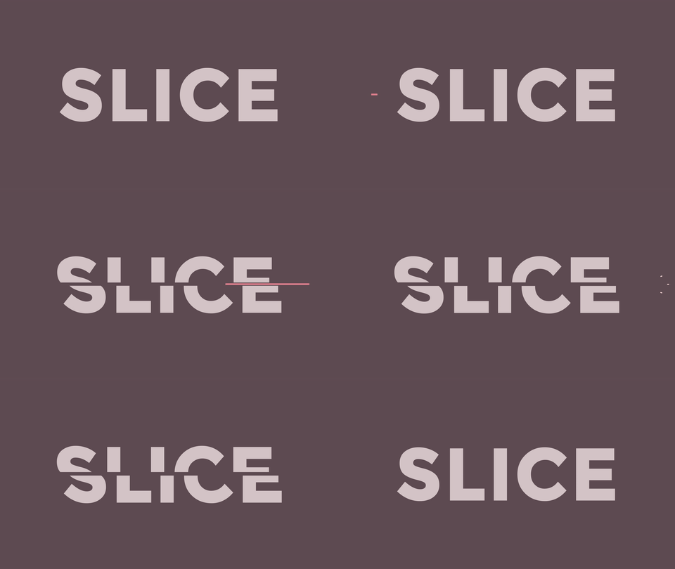
Here we go, Day 4 of the #15minmograph challenge. I have a feeling I am going to get less and less detailed in these posts about it.

I am really trying to hit all the bases of motion design. Character – check. Vector – check. Today we check off typography. Check.
This is an animation move you see a lot in explainers and I am yet to have used it in any client work, which is weird because I really like the look. It is clean, simple and super illustrative, and now I know I can do it in 15 mins. What I also reinforced today is my love for Coolors.co. It is amazing. With a tap of the spacebar and you have an elegant or bright or complementary colour palette hex values and all. Need to build a palette around and already existing colour or colours, lock them in and <spacebar>. Now, it may sound like I am sponsored by them or something. I’m not, just a major fangirl.