On Day 4 in the 30 Days of After Effects by School of Motion looks at using Corner Pin to add perspective to stills and emulate 3D space.
Sheep Industry Projections
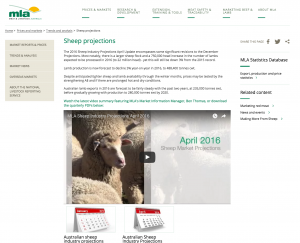
Once again contracting with Anvil Media, I was tasked with editing and producing infographics for another Meat and Livestock Australia (MLA) industry projections update. This time for sheep.
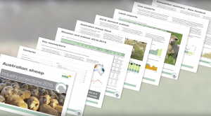
In the same style as the last projections (Cattle Industry Projections), this was a straight-to-camera, update from MLA’s Market Information Manager, Ben Thomas, with the infographics and a few cutaways for coverage. Being the same style I used the After Effects template as a style guide, this time building from scratch to significantly cut down render time and processing power needed, as well as allowing for a little more stylistic and timing control. One element of the video that I was particularly proud of was the report spread (at about 2:22 in) which gives the market report PDF a nice fan display and highlights the documents significance to the videos audience.
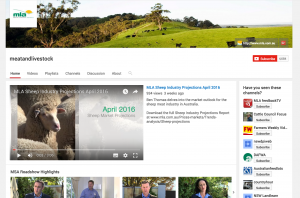
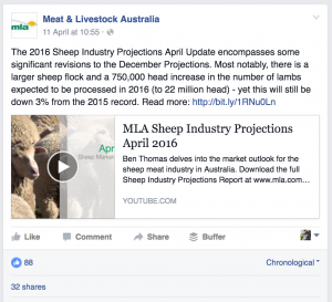
I was quite happy with the results and whilst not as popular at the Cattle Industry Projections, the video still took centre stage as feature video on MLA’s YouTube channel, sits on the MLA website and was shared via their Facebook page.
Cattle Industry Projections

Over the last 3 weeks, I have been contracting with the Sydney office of a production company, Anvil Media, that specialises in serving the agriculture industry. This project is a synthesis of vital information from Meat and Livestock Australia to the cattle industry. The latest in a quarterly series, much of the project look and feel was pre-established. This was also the first time I had worked with an After Effects template. As much of the video is covered by graphs Anvil had on hand a graph producing template. I found this very confusing to work with at first as much of it was constructed with expressions, this made it somewhat hard to customise and also meant that the render time was enormous. The way this template worked is that a data bar was built based on a numerical figure placed in a hidden text layer. The difficulty came from mathematically aligning the hidden numerical figure to the Y-axis scale. I did have fun compiling the iPhone App graphic, using the screen reflection to add some texture to the app screen grabs overlays.
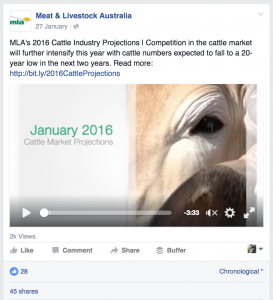
Being a niche industry I was surprised to see the view count at nearly 1k only four days after launch. Much of this may be to do with the video taking centre stage of MLA’s website, social sharing or an email marketing campaign that I am unaware of. It really goes to show that niche audiences can be the most responsive to an informative and highly relevant piece.
